Many of us have had macwould once have the opportunity to see a Graphic Presentation in various fields: the evolution of the exchange rate, election results, statistics, etc. The most popular program is charting Microsoft Office Excel. It values a tabular calculation in one graph according to lines si columns for the reporting. In the following we will briefly introduce how to realize a simple graphic.
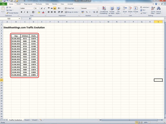
The first step to do is to compose a table based on results according to at least 2 references. Table must contain cells with numerical values: numbers, dates, percentages, depending on the category to ask wish to relate.
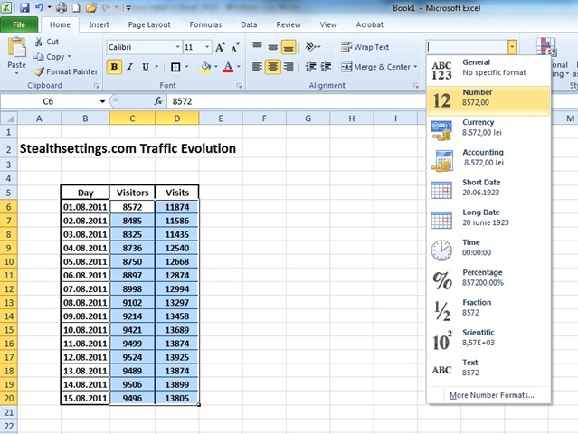
cell format is achieved by selecting fields with values and choosing from the Tab Home attributes for these cells: General, Number, Currency, Accounting, Date, etc. After we defined data fields table, numbers, percentages, etc., choose the columns then do reporting and chart by selecting them with mouseAnd in the tab Insert, section Charts, Choose the type of graphic that we want to achieve for the selected field.
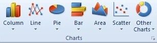
Here we have a lot of graphics options from column representations of various shapes, colors and sizes, line graphs connected by points, graphics disk type, horizontal bar graphs, charts form surfaces, graphs with points or ring all provide the opportunity to illustrate the evolution of image values according to at least 2 references. For greatest impact can be made in variations charts 2D or 3D for each of the options above.
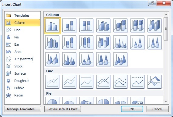
We choose a chart type column in which I used 3 references: date, number of visitors and number of visits.
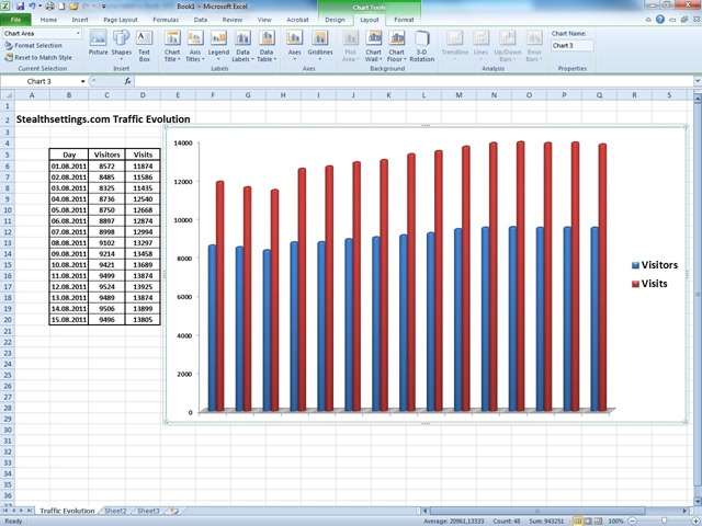
After creating the schedule of option Charts Tools We can customize chart and other information about the table represented by this graph, we attach schedule table in the basement of the option Data TableWe can customize Legend, display reference axes, reference lines and other features that can improve the quality of the graphic presentation.
After completing this schedule may be inserted into a presentation PowerPoint or can be printed on the sheet of paper or foil for a presentation.